

Techniques of Correspondence & Cluster Analysis

Correspondence Analysis:
A Market Segmentation technique that GRAPHICALLY represents the relationship between BRANDS/PRODUCTS and variables such as ATTITUDES, MEDIA TITLES etc. In TGI (Target Group Index Software), it is also an exercise to determine most discriminatory lifestyle statements before cluster analysis.
Steps to set up a crosstab in choices (TGI – Target Group Index)
Filter: F 25-44 ABC
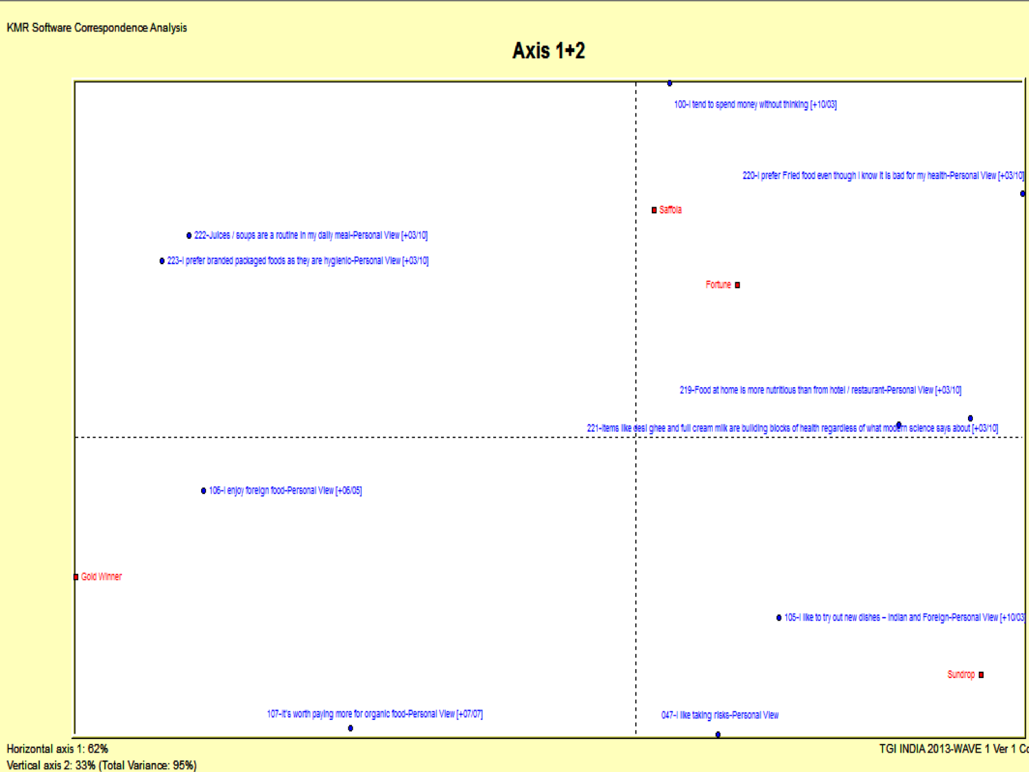
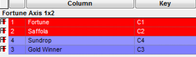
Columns: Cooking Oil Brands (Fortune, Saffola, Gold Winner, Sundrop)
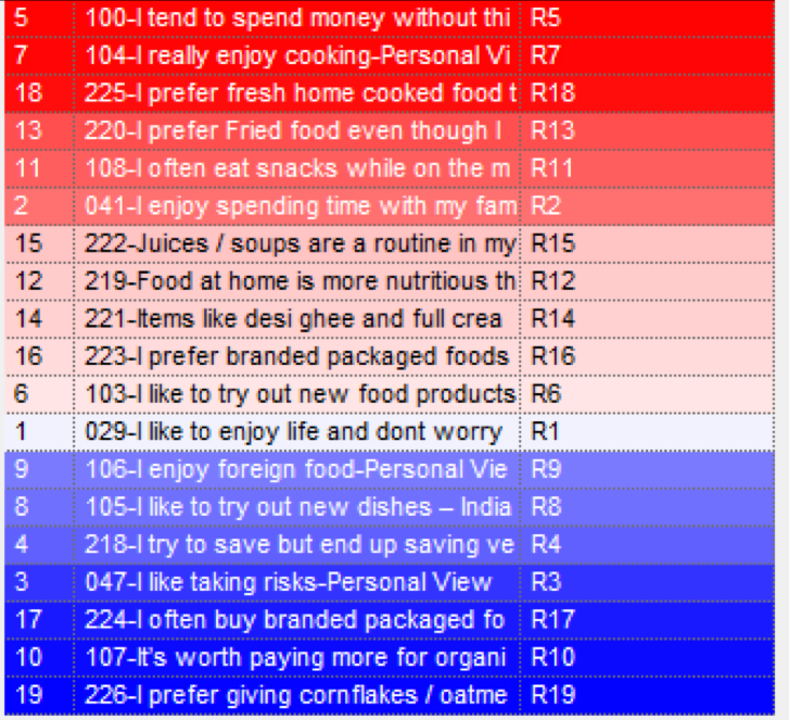
Rows: Series of Statements
- Enter brands/Products in columns (Sample sizes > 200)
- Enter either any agree or definitely agree lifestyle statements as rows (15-20 statements recommended)
- Enter ‘all users’ of the category as your filter (Sample size > 2000)
- Edit your headings so they are concise
- Save and then Run the crosstab
- Select correspondence analysis using the icon
 or going to the “Analysis” options
 - The Correspondence map will be generated within the Choices Viewer along with the related statistics.
- If you want to ‘overlay’ info. enter this into columns (e.g. demographics/media)
Statements:
I like to enjoy life and don’t worry about the future | I enjoy spending time with my family | I like taking risks | I try to save but end up saving very little | I tend to spend money without thinking | I like to try out new food products | I really enjoy cooking | I like to try out new dishes – Indian and Foreign | I enjoy foreign food | It’s worth paying more for organic food | I often eat snacks while on the move rather than eating a proper meal | Food at home is more nutritious than from hotel / restaurant | I prefer Fried food even though I know it is bad for my health | Items like desi ghee and full cream milk are building blocks of health regardless of what modern science says about | Juices / soups are a routine in my daily meal | I prefer branded packaged foods as they are hygienic | I often buy branded packaged foods as they are more convenient to use | I prefer fresh home cooked food than the packaged / ready to eat food as they have lot of preservatives | I prefer giving cornflakes / oatmeal instead of the regular breakfast to my family
Correspondence Map
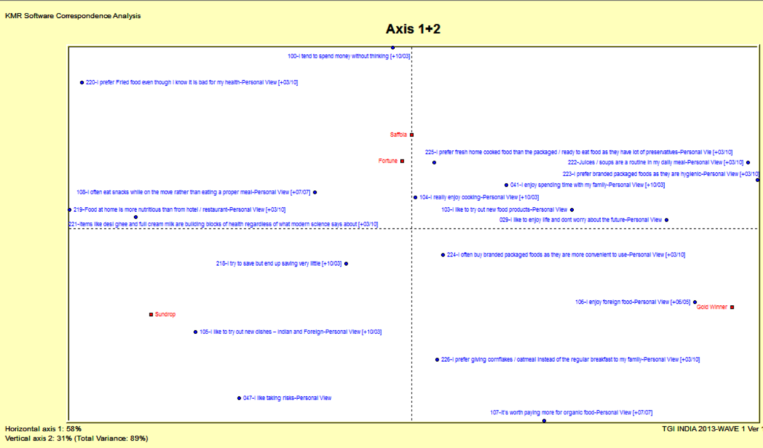
At this stage, you will want to select statements that best describe your map and eliminate rest.
- In the Choices Viewer, select the Statistics view and expand General Statistics
- Click on “Rows”
- Click on the “Dist” column (this sorts the rows by ‘Chi-distance’)
- Right-click on the rows and choose “Select top n…” and then choose the number of statements you wish to include in the map (usually about 15-30)
- Right-click and choose “Invert selection”
- Right-click and select “Change status” …and then “to passive”
- Select the map from the analysis tree
- Right click on the map and choose ”Select” and “All passive rows”
- Right click again on the map and select “Hide”
- Edit the map by moving the labels and changing text where necessary
- To rename the map, from the toolbar select “Edit” and “Title”
- To insert labels for the x and y axis, from the toolbar select “Insert” and “New label”
- If you are going on to do a cluster analysis – print the statements used in the map: Ensure you are in the “Statistics” view and then choose “File” and “Print“
- Alternatively – ‘Select’ from main menu è Clean up / Auto Clean up
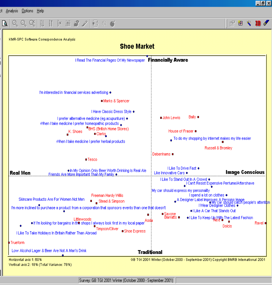
Interpreting Correspondence Map
Variance explained needs to be at least 60% to give sufficient explanation of the data
Correspondence map is produced based on two themes (dimensions) which were strongest with data
- Most important being X axis and 2nd best being Y axis: Define what each Axis will represent
- Add map to select any other axis than 1 and 2

Assessing the relationship between two brands
- Angle = 0 / 180 = higher positive or negative relationship respectively
- Angle = 90 / 270 = Little or no relationship
Assessing the relationship of brands to a statement
- Positive relation if brand on the same side of statement line from origin; negative if vice versa
- Closer the brand to origin weaker the relation; later towards the ages stronger the relation
- Brands around center of the map will be ‘Average’ and near edges will be more extreme of showing variations (in practice usually these might be smaller brands who attract more specialist or distinctive consumer)
Reading the Correspondence Map
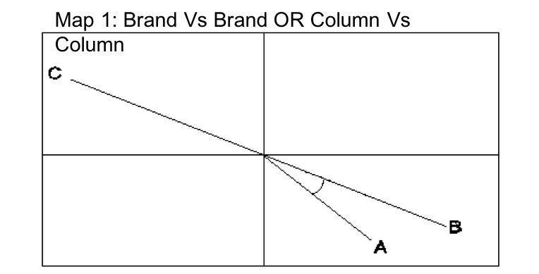

- What is the relation of Brand A and Brand B in Map 1?
- What about Brand A and C?
- What is the relation of Brand A and Statement Z in Map 1?
- What about Brand A vs X and Y?
Alternatively,
Column Vs Column Analysis
(For each brand)
Column Vs Row Analysis
(For each brand)
brands in red color indicate strong correlation and those in while have no correlation. Brands in blue have negative correlation. Top brand in Red and top brand in blue are the opposites in market.
A few checks on correspondence
- Mass / Dist / Inertia
- Mass: % of data in the crosstab
- Dist: Chi squared distance tells us how well theoretical data fits observed data. It is calculated by measuring ‘expected’ value of the cell and comparing it with actual observed data
- Expectd value occurs when there is no relationship between row and column
- Inertia: Break down of ‘Variance Explained’ = mass x distance
- Total Eigen values across all dimensions = total Inertia on that axis
- Coordinates – position of row/column points on axis w.r.to dimension
- Formatting Map Display

- Overlay the info like Media consumption, Freq info, Cluster groups, Non users of brand/ cat, Demographics, brand Consumptions
- Analysis Wizard of 3D Display variables
 and then
- Menus…
Overlaying Data
Once you have generated your map you can overlay any other survey data onto the map to see where it would be placed. Because a cross tabulation must be re-run to overlay data, any previous editing that you have done will be lost. Common examples of the sort of information you might want to overlay are:
1) Media consumption
2) Frequency information
3) Cluster groups onto the original correspondence map
4) Non-users of the brand(s) you are interested in
5) Demographic groups such as age or social grade
To overlay data you should follow these steps:
- Work from the original spec file that you used to generate the correspondence map. Add the extra information (e.g. TV programmes) as columns.
- Re-run the correspondence map from the crosstab.
- Make the points you are overlaying passive first, so they don’t influence the shape of the map.
- Remove the less discriminating lifestyle statements.
- Tidy up the map.
The points that have been overlaid will now be superimposed onto your map. These are colored green by default.
Cluster Analysis
Allows users to segment given population in discrete groups of similar individuals
Exercise
- BRIEF
- New channel launch
- Channel targeted to Youth
- Channel content is a mix of Music and Edgy shows
- Task :
- To identify consumer clusters based on TV viewing behavior : create “media clusters”
- TG Filter: AA 15-34 AB
- Highlight “Type of Telecast Watched” under Television viewing è “I specially choose to watch it” è add to rows
- To identify consumer clusters based on TV viewing behavior : create “media clusters”
What is Media Cluster & Why it’s done?
- Within a target demographic there are distinct homogenous media clusters and each cluster will have its peculiar manner of consuming TV and other media
- Such clusters are sharp focused on media consumption behavior, thereby giving distinct Genre/ Media choices
- Building consumer clusters segregated by TV consumption behavior and linking it to other media consumption will help us get better granularity
Understanding ‘viewing’ clusters of target group through TGI and Implications for media choices to market a new channel
STEPs
- Preparing for Cluster Analysis
- Run Correspondence Map (Filter Sample Size > 2000)
- Identify the strongest statements (Maximum 15-20 statements)
- Take printout and keep by your side
- Saving Cluster File
- Using the original input file, from the toolbar select “Tools” and “Save Cluster Filter File”. This uses your filter as part of the cluster program and forms the universe to be segmented. (Sample size for your filter is greater than 2000)
- You will be asked if you wish to run the cluster analysis.
- Select “Yes”
- Run Correspondence Map (Filter Sample Size > 2000)
Running the Cluster Analysis
- Select “Start a new cluster project”
- Select the database to be used (i.e. the survey you used for the Correspondence Map)
- Choose a filename (max 6 letters) and a title for your work
- Select ‘Change Filter’ and then choose the base/filter you were using in Choices3
- Select lifestyle statements by clicking on the ones you wish to use (as listed on your correspondence printout)
- Now select the icon “Run Cluster”, selecting a solution number (i.e. the maximum number of cluster groups you think you might want e.g. 9)
- When the analysis has completed, select the cluster report and then go to the section below on interpreting the cluster analysis
- Go to “Tools” and “Import Cluster Solution” – it will appear at the bottom of your dictionary
- Can either further run crosstabs or
- Overlay in correspondence by putting it in columns and running it. Make cluster solutions passive
Reference for Cluster Exercise
TG: AA 15-34 AB
News | Family Drama/Serials | Comedy Serials | Reality Shows | Hindi Movies | Game Shows | Music Programmes | Cricket Matches | Other Sports | Youth | Lifestyle / Fashion | Travel / Places
Interpreting Cluster Analysis
3 Stages of Interpretation
- First two establish if there is minimum and maximum no. of cluster groups that you should use, based upon some statistics
- Last stage is more creative and involves the user selecting the best solution (i.e solution 7 – which will have 7 groups in it) for describing your category
- Go to “Cluster Report” and establish if there is a minimum number of groups that you can use (Variance explained should be > 12)
- Check the maximum number of groups you can use by ensuring the smallest group figure is > 200
- Decide which cluster solution is most appropriate:
- Start by looking at all the cluster groups within each solution
- Summarize the characteristic of each group in terms of overall attitude (give each an appropriate name to summarize)
- Repeat the process of summarizing characteristics for next solutions
- Find a point where using further cluster solutions adds no information or indeed loses some group information – at this STAGE you have found the optimum cluster solution for dividing the market
The TGI output : solution
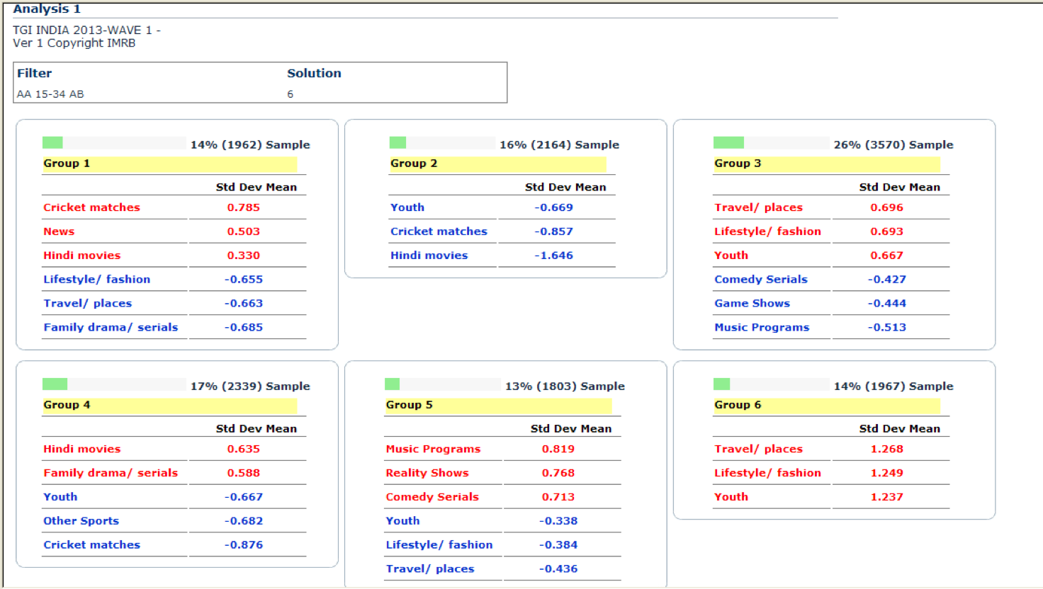
TV genre cluster led by niche amongst core demo TG